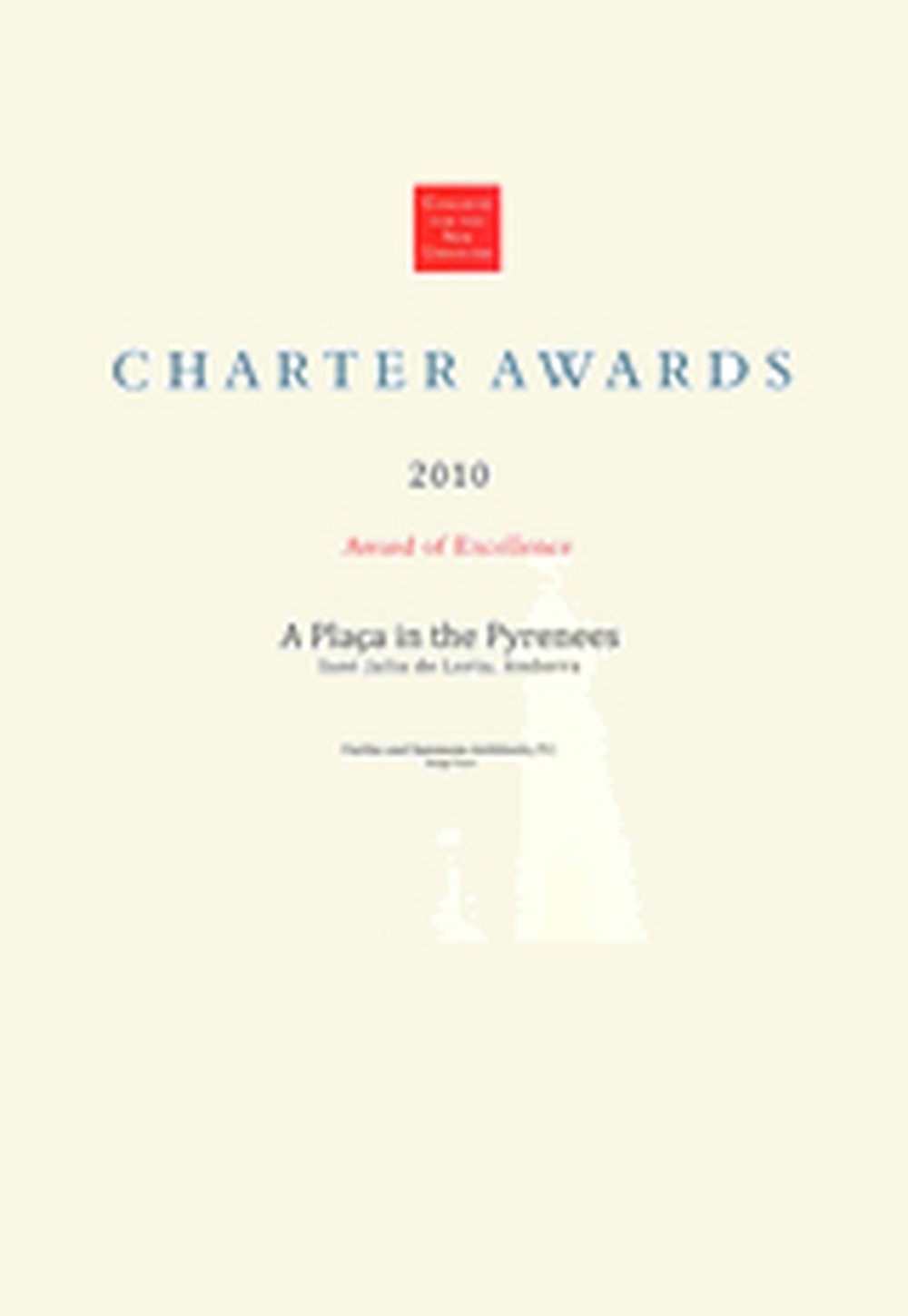
Fairfax & Sammons Wins our 2nd CNU Award, 2010
March 20, 2010

FAirfax & Sammons won a prestigious CNU Award this year, Best for Small Town modernization - Sant Julià de Lòria, Andorra in the Pyrenees and also in 2008 for A Vision of Marion Square in Charleston, Sout Carolina. The projects are based on the Charter principal: In order to promote the economic and general welfare of the city and of the public generally, and to insure the harmonious, orderly and efficient growth and development of the municipality, it is deemed essential by the city council of the city that the qualities relating to the history... of the city and a harmonious outward appearance of structures which preserve property values and attract tourist and residents alike be preserved; some of these qualities being the continued existence and preservation of historic areas and buildings; continued construction of buildings in the historic styles and a general harmony as to style, form, color, proportion, texture and material between buildings of historic design and those of more modern design; that such purpose is advanced through the preservation and protection of the old historic or architecturally worthy structures and quaint neighborhoods which impart a district aspect to the city and which serve as visible reminders of the historical and cultural heritage of the city, the state, and the nation.
RESPONSE TO CHARTER PRINCIPLES - A Plaça in The Pyrenees - Andorran University
This mixed-use infill project is to be built on a brown field site and heals an obvious wound in the existing urban fabric, by reinforcing an identifiable edge. It is very dense with the complete spectrum of uses, and from Institutional to Retail, Office, and residential, anticipating a jobs/housing balance. The design allows for variety of unit sizes and price points.
This project emphasizes pedestrian connectivity and is served by a transit line along the main road. It restores a pattern of small alleyways and squares. The Institutional building is embedded in the fabric of the neighborhood and is hierarchically identifiable by it scale, level, architectural details and materials.
All the buildings have substantial thermal mass and insulation and shared sidewalls. All are of traditional Andorran typology and of traditional materials and robust structure.
As the student body is projected to be 300 ft. The University will draw activity to the new Plaça and proposed retail. Residential population could be another 300, depending on final configuration of apartments vs. office space.
The three Plaças, one restored and two new, all have different characters, and reserve places for civic art or monuments. The market cross in the Plaça Minor will be reinstated. The Plaça Univeritat and Plaça Minor are completely pedestrian allowing children to play safely and students gather. The site is connected to the natural landscape visually with controlled vistas and physically by a pedestrian bridge cross the river that gives access to parkland and communal garden plots.
The stair from the Plaça Minor winds about a votive column and has benches on the landings and a fountain at its base. The university building has a seating ledge inviting people to rest and enjoy the activity in the Plaça. Handicap and emergency vehicle access to the Plaça Univeritat is via existing alley ramping down from the upper street.
Sant Julià de Lòria is the first habitation visitors come upon when traveling up the valley from Spain. The mixed-use building on the road south of the university is angled back to reveal the corner of the institution. Its Romanesque tower and Medieval design of the single arch pedestrian bridge marks the picturesque entry to the country and recreates the lost urbanism of Andorra’s recent past.
RESPONSE TO CHARTER PRINCIPLES - A Vision For Marion Square
In contemplating our goal, it became obvious that the existing city plan was strong around the square and that it was the ideal location to absorb the inevitable future development. A few principals guided the Vision group:
1) URBAN INFILL WAS NECESSARY, and densification was needed to both create a sense of enclosure and to provide for the critical mass of people necessary to enliven the square and supports the uses that will grow up around it. Tightly planned mixed-use will help establish life on the square throughout the day and evening, making the square feel busy, popular and safe. The Vision Group felt strongly also that the size of the 10 acre square warranted a higher density than the surrounding neighborhoods and that promoting taller buildings would result in a beneficial sense of enclosure as well as create needed density to sustain a walkable community.
2) DIVERSITY OF USE Existing institutions were kept, such as churches and lodges, and lots were designed for civic uses such as an opera house or museum. Hotel and mixed office/retail and apartments along with some detached housing to infill unused parking lots adjacent to the square were proposed.
3) TRAFFIC AND PARKING MANAGEMENT In order to calm traffic and provide additional parking to encourage use of the square, we proposed more on-street parking down both sides of the streets on three sides of the square. This will also slow traffic. In addition to pedestrian crossings at traffic lights junctions, mid-intersection pedestrian crossings are proposed on each side of the square. The presence of parked cars provide a “car barrier” to pedestrians that promotes a sense of a safer sidewalk rather than one with a busy street next to it. We widened some sidewalks to encourage street cafes and street furniture.
4) BUILDINGS DESIGNED FOR THEIR PLACE It was intended to design buildings which would withstand the natural climate forces (hurricanes, extreme heat in summer) and would be made of enduring materials. The use of masonry along with shutters, loggias, windows that open, openings that can be shaded and cross ventilation which would mitigate the use of air conditioning.
5) DENSIFY AT TRANSIT CORRIDORS The square is well positioned to be a hub for transit and providing more urban infill around it will reinforce its already natural position. It has well-developed retail/ office streets east and west of it, and a strong cross street at the south which connects to bridges beyond.
6) REINFORCEMENT OF COMMUNITY IDENTITY The Square reinforces community identity and the culture of democracy. The buildings all face on to the square in deference to this hierarchy of public amenity and is large enough to accommodate crowds of people for the farmer’s market, tree-lighting ceremonies, locally sponsored races and festivals.
7) PRESERVATION & RECYCLING The presence of significant carefully crafted existing buildings was considered and they were preserved in the design and integrated in to the Vision plan. The re-use of the steel skeleton of an existing building was considered for one of the hotels in order to mitigate the waste and consider recycling of high energy state materials

